Animation
The assignment for the module Animation this semester was as follows:
Semester assignment:
Walking Cycle
You will create an animation consisting of several animation disciplines in which you portray yourself, e.g. as a designer personality.
The aim of the assignment is to experiment with different animation techniques and create a production sequence.The required components include:
- Concept Presentation
- Animation
- Primary & Secondary Action
- Character & Environment
- Character Rig (parenting)
- Kinetic Typography
- 2.5D Element(s)
- Particle
The task was clear…creating a cool animation!
So first things first…
Brainstorming:
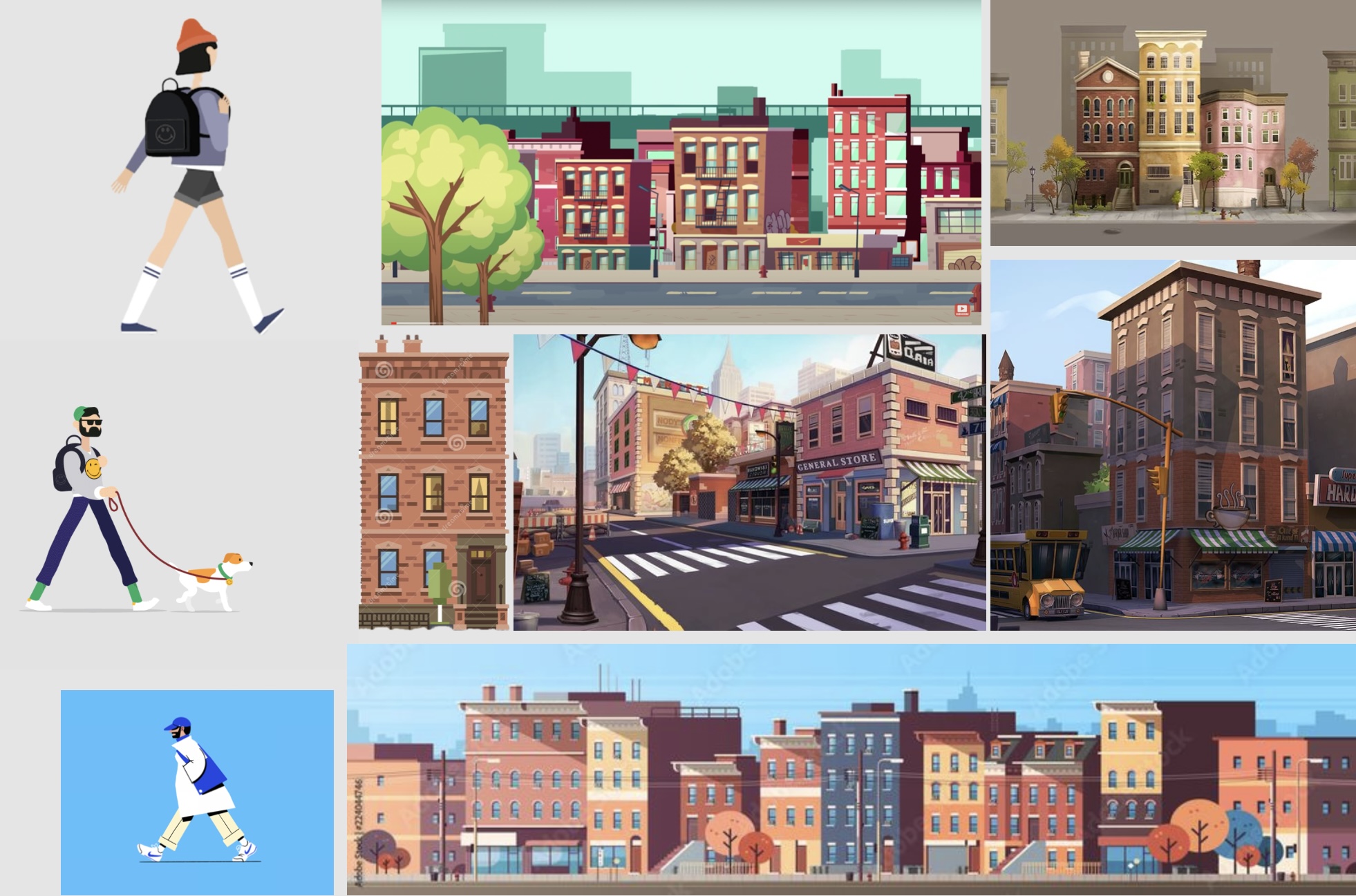
I started thinking about how exactly my character and its surroundings should look like. I scoured the internet for inspiration and created a mood board.
Character Design:
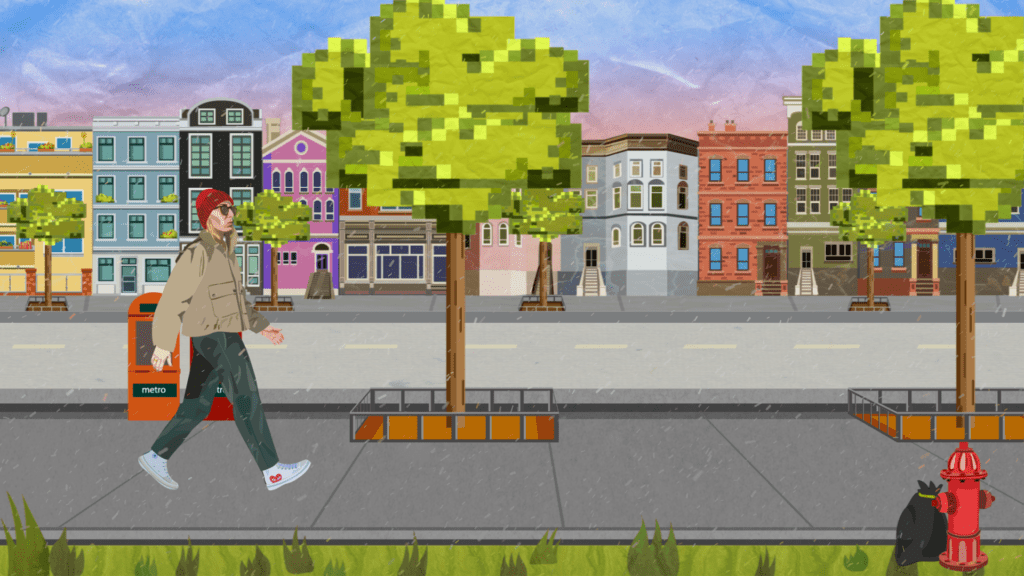
For character design, I aimed to replicate the style I developed for my previous semester’s „Audiovisual Media“ assignment. The style is characterised minimal areas of colour, yet with intricate attention to detail, as evident in the facial features, particularly the glasses, and the shoes. I also included my ring on my right hand.
To achieve this level of accuracy, I used photos of myself as a reference and drew the character in Adobe Illustrator.
A classic vector illustration so to speak. When illustrating, I made sure to divide the limbs into different layers in order to do the necessary preparatory work for the rigging.
Environment Design:
I also used vector illustrations for the background of my animation.
I chose a classic cityscape for the environment, as I had originally intended to set my character in New York. However, during the editing process, I added some easter eggs, resulting in a mix of architectural styles that broke up the uniformity of the row of buildings.
Perhaps this could also be considered an anecdote about the gentrification of urban areas in New York.
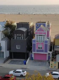
The first Easter Egg will probably be more recognisable to GenZ than any other age group. It’s the viral ‚Barbie beach house‘ in pink and purple, with a contrasting black house next door.
I even included my own family home in the row of houses.
The Rest of the Environment:
I decided to keep the look of the vector illustration for the rest of the environment.
However, I attempted to add some variety to it creating more of a video game-like appearance, similar to the pixelated graphics of old video games.
To achieve this, I imitated this pixelated look for the treetops and flower pots on the balconies of the houses.
I also wanted to place my character in the middle ground, so I created a narrow strip of green at the bottom of the image, which occasionally houses a few garbage bags with flies buzzing around them in the form of kinetic typography.
At the bottom of the image is a narrow strip of green, which occasionally contains a few rubbish bags with flies buzzing around them in the form of kinetic typography.
After Effects:
With all the preliminary design decisions made and finalised, I could now move on to the animation and editing process in After Effects.
Rigging the Character:
In order to rig my character, I first looked at different options, including Duik Bassel and anchor point rigging. I chose the latter, which proved to be very time consuming and required a lot of fine tuning to achieve a satisfactory result.
Nevertheless, I took my illustration into After Effects, parented the limbs in the correct order, arranged them accordingly and moved the anchor points sensibly so that my character could ultimately be handled like a marionette.
Once this process was complete, I studied various examples of different walking cycles and used them as a guide to create my own.
Once the walking cycle was complete, I created a sub-composition and looped it.

Kinetic Typography:
As teased above, I have added the obligatory amount of kinetic typography to my rubbish bags.
Here you can see what appear to be small black flies buzzing around the rubbish.
On closer inspection, however, you will notice that the supposed little black flies are not flies at all, but flying mailboxes.
To achieve this visual illusion, I used the Wingdings font, which turns dots into little mailboxes.
I also turned this text layer into a 3D layer, which allowed me to further refine and stylise the „flies“ using animators and „blur“.
2.5D Element:
My 2.5D, or almost 3D, elements are my trees and stone paths that run past my character.
The tree is completely made of 3D layers. In particular, the grid, which consists of a text layer with the letter „T“ and various shape layers, gives the impression of a central perspective and thus gives the whole scene spatiality.
The grout is a grey solid with a grid effect.
I then simply subordinated all the elements, i.e. the grout, the grid floor, the individual grids and the Illustrator tree, to a null object, which I moved in its position using keyframes.
This composition was then looped with time distortion and duplicated. So you can see the same tree three times, defined once a simple loop and twice a longer expression:
- (delayFrames = thisComp.layer(„Tree Comp 4“).effect(„Slider Settings“)(„Slider“);delay = framesToTime(delayFrames);thisComp.layer(„Tree Comp 4“).timeRemap.valueAtTime(time-delay)
All layers are shifted either an offset or a loop expression, giving the impression of a parallax effect.
- House facade: By an offset and loopOutDuration(type = „cycle“, duration = 0)
- Street: By an offset and loopOut(„cycle“)
- Pavement the character is walking on: By an offset
- Trees: As described above, using a loopOut(„cycle“) and longer expressions
- Mailboxes: Also delayFrames = thisComp.layer(„Tree comp 4“).effect(„Slider settings“)(„Slider“)*3;delay = framesToTime(delayFrames);thisComp.layer(„Tree comp 4“).timeRemap.valueAtTime(time-delay)
- Walking cycle: Through a loopOut(„Cycle“)
- Grass: By an offset
Each element also has its own texture:
The houses in the background, the pavements, the road in the middle, the grass and the treetops in the foreground all have their own texture.
For the treetops and the background, I decided to use a „paper texture“ to emphasise the first features of the gamified environment, while also creating the illusion of a mountainous area. Matching the light snowfall.
Particles:
I used a solid with a snowfall effect as particles.
Finally, I created an adjustment layer in which I set the „Brightness & Contrast“ and „Dynamics“ of the scene.