Visual Communication
For our assignment in the Visual Communication module, we had to develop a corporate design for a product and were given 3 different industries to choose from. I chose the cosmetics industry and right from the start I had the idea of developing a product containing the special ingredient gold, specifically a serum with gold particles.
The name of my company was easy to choose… „Golden Cosmetics“, although I also thought of „Golden Facials“, but this brand name would limit the product world too much, as it’s name suggests that it only focuses on facial treatments.
I have chosen women over 30 as my target group, who pay attention to their appearance, the clothes they wear, and the aesthetics of the products they use. My goal is to develop a cosmetics company with a luxurious appearance and high-quality products in the mid-to-high price range.
My first step was to create a mood board of my ideas for the industry, product world, colour palettes, typography and fonts, as well as different logo variations.
I decided to use a very minimalistic approach for the colour palette, opting for black, white, and gold. For the font, I chose a clean sans-serif to give the product a modern and premium feel.

After creating the moodboard, I began implementing my ideas into a real corporate design. I sketched out various logo designs using pen and paper, aiming to create the perfect combined word-and-figurative-mark for my brand. Next, I selected the most promising designs and transferred them to the digital world using Adobe Illustrator. During this process, I created a total of 15 variations of the logo, trying to incorporate an abstract sun as the figurative mark and the word mark ‚Golden‘.


After my initial selection, these 15 logo variations were put through a rigorous evaluation process to determine which of them would be used as my final logo.
The judges, I might add, happened to be my friends…

And „tadaaa!“ the final logo has been chosen.
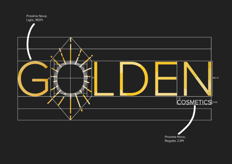
Now for some additioanl info for typography enthusiasts amongst you… the logo showcases the word ‚GOLDEN‘ in the Proxima Nova/Light font, with an abstract sun replacing the letter ‚O‘. I placed the word ‚cosmetics‘ in white and smaller font on the right side below the ‚GOLDEN‘ lettering in Proxima Nova/Regular typeface. This draws attention to the word ‚Golden‘ and helps create associations among the target audience. It also highlights the main ingredient of the product, which makes it unique.
I chose different typefaces to achieve a feeling of lightness, reduction, and high quality for the ‚GOLDEN‘ lettering and to ensure that the ‚cosmetics‘ lettering is still noticeable despite its smaller font size.
In addition to this, I used a bokeh effect that I had created in Adobe Illustrator. The colours yellow, brown, and white were used to create the appearance of reflecting gold particles, representing the ingredient.
I applied the bokeh effect to the ‚GOLDEN‘ lettering using a clipping mask. I paid particular attention to the placement of the word and figurative mark to ensure that the abstract sun appeared bright on the inside and gradually darker towards the outside, representing a shining sun.


After a long process of designing my logo, I was finally able to move on to the next step: the use of the logo on the actual product.
I studied the EU regulations for labelling cosmetic products and various serums, taking note of their ingredients and design. After this brief research, I went back to my favourite part: designing!
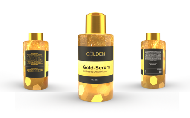
I have created a product sticker that measures 14cm in length and 5cm in height. The sticker is divided into three parts.
The left side of the sticker contains a brief explanation of the product, the benefits of its ingredients, and instructions for usage. This information is presented in gold to create a visual connection between the left and central areas of the sticker, which includes the logo and headlines. This design follows the law of similarity.
The two thematically distinct text areas, the product description and the instructions for use, are separated a narrow white line.
In the middle, framed the narrow golden rectangles, the logo is placed in the upper third, creating a golden ratio.
The headline of the product, describing it as ‚Gold Serum‘, together with the sub-headline ‚Oil-based Antioxidant‘, giving further information about the product, is placed in a golden rectangle in the centre below the logo. Both also use the Proxima Nova typeface. The headline is set in bold so that it can be easily read from a distance, such as on the product shelf. The subheading has been given a medium weight font, as it is only read when the product is in close proximity. As with all product labels, the ingredients of my gold serum are listed on the right, as required EU regulations. The cosmetic company’s address, country of origin and expiry date can also be found here.


